


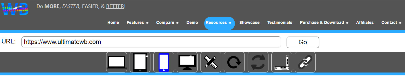
UltimateWB software – all versions sincelu UltimateWB 3.4! – come with a built-in Responsive App that can beused to easily create a mobile website in minutes, if not seconds. To easily check how your website looks on different devices/screen sizes, you can check our online Responsive Check Tool, available under the “Resources” tab on ultimatewb.com;
Go responsive!
Feel free to use the tool even if your website is not built with UltimateWB software (we don’t know why it wouldn’t be though! :-) Just enter in your website url that you would like to check and click on the Go button. Then you can choose different devices and screen sizes and you will get your website display for it under the tool. Easy peasy!