Having your website menu display to the right of your logo is becoming the go-to design choice more and more, so we decided to add this setup as a header template option. Get this 1-click header logo/menu setup with our newest UltimateWB software upgrade 6.7 – for all versions!
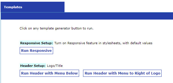
On the Templates generator page, choose between “Run Header with Menu Below” and “Run Header with Menu to Right of Logo”

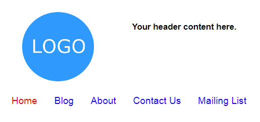
Here is an example of the website navigation menu below the header:

And here the menu is to the right of the logo:

When to display your navigation menu next to your logo?
If you don’t have many items in your menu, and you don’t have content you want to display next to your logo, the menu works great there. It fits, and it makes great use of the empty space next your logo.
When to display your navigation menu below your header?
On the other hand, if you have lots of pages in your menu, it needs a lot more space and you don’t want it to feel like it’s squished to fit. Putting your menu under the header in that case would make it more user friendly. You don’t want to try to fit all your pages under only a handful of top level links if it doesn’t make sense.
How the menu displays with the responsive website:
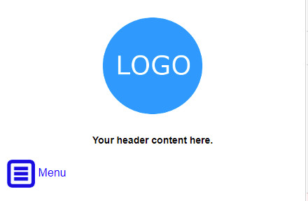
The header is responsive in a responsive website, so the menu displays as an expandable button, and the logo and header content centered automatically when the header templates are used.

All UltimateWB website builder software versions come with the 1-click Responsive template, and you can also configure various aspects of the built-in Responsive app via your website admin panel styles manager.
Hope you enjoy it! We welcome your feedback!


