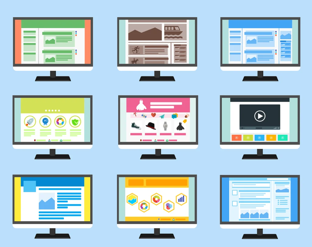
Absolutely! Certain color schemes can significantly impact a website’s perceived modernity or outdatedness. Here are some factors to consider:
Outdated Color Schemes:
- Bright, neon colors: These were popular in the 90s and early 2000s but are now considered outdated and can make a website feel dated. Unless you are Nickelodeon. Sponge Bob Square Pants!
- Large, contrasting color blocks: While they were once used for emphasis, they can now appear amateurish and overwhelming.
- Overuse of gradients: Gradients were popular for a while, but excessive use can make a website look dated and unprofessional.
Modern Color Schemes:
- Muted, pastel tones: These colors create a soft, calming, and modern aesthetic.
- Monochromatic palettes: Using variations of the same color can create a sleek and sophisticated look.
- Complementary color pairs: These colors create a visually appealing contrast and can add a touch of modernity.
- Earthy tones: Natural colors like browns, greens, and blues can give a website a modern, organic feel.
Remember, the key to a modern color scheme is balance and subtlety. Avoid overwhelming the user with too many colors or overly bright hues. A well-chosen color palette can enhance the overall design and user experience of your website.
Are you ready to design & build your own website? Learn more about UltimateWB! We also offer web design packages if you would like your website designed and built for you.
Got a techy/website question? Whether it’s about UltimateWB or another website builder, web hosting, or other aspects of websites, just send in your question in the “Ask David!” form. We will email you when the answer is posted on the UltimateWB “Ask David!” section.


