We have recently released an upgrade for the Responsive app in UltimateWB Full, Lite, and Essentials+, upgrade 7.2.
If you are using the non-scrolling top menu feature on your website, with the right/left sides content added to the menu bar , you will want these new responsive customization options. Namely, you can now update the width of the non-scrolling top menu bar based on a user’s screen size. No coding necessary – just update the fields on your admin panel Styles Manager, Responsive section.
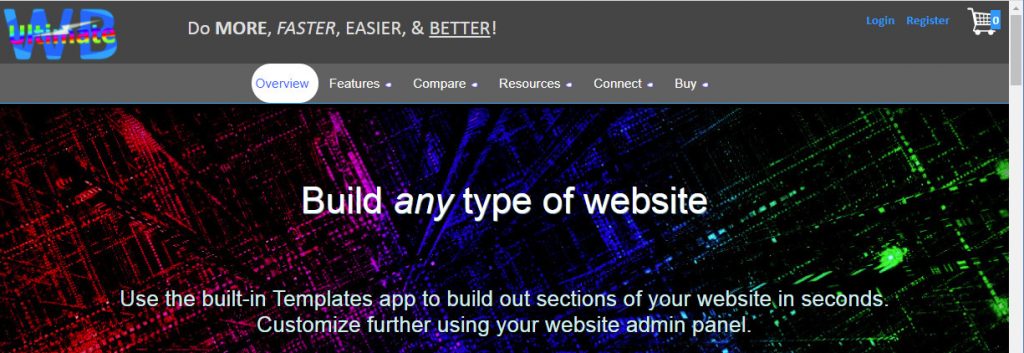
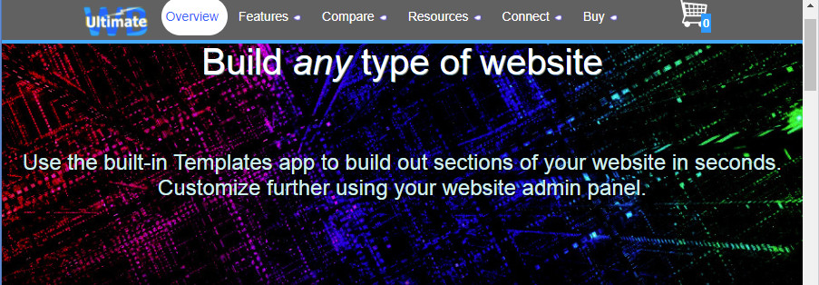
You can check this new Responsive app feature out on our website ultimatewb.com – scroll down and the menu bar jumps to the top, with the UltimateWB logo on the left side of the menu, and the shopping cart icon on the right:

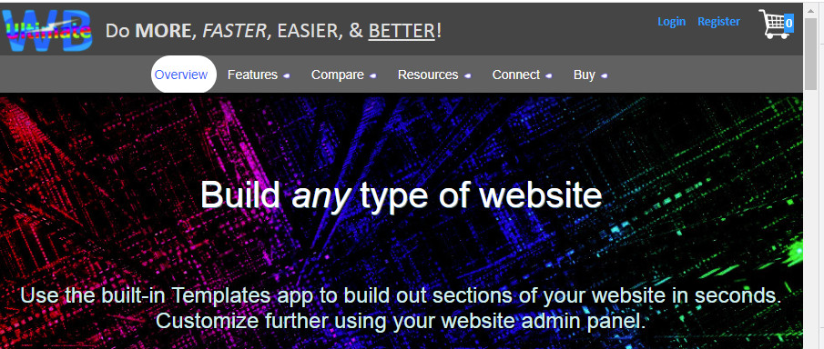
Resize your internet browser window to simulate a user’s different device screen size, and you will find that the menu widths adjust accordingly, for a very user friendly experience:
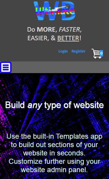
And, of course, there is still the Responsive feature geared towards smartphone screen sizes, where the menu button is used rather than the menu row:
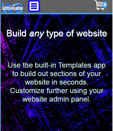
This new Responsive app upgrade is not applicable to UltimateWB Promo and PromoU, as those two versions don’t include the left/right content options for the menu. UltimateWB Promo/PtomoU do have the non-scrolling top menu feature though, with the option to set the menu width at a different value than the page’s menu width.
Hope you like the new upgrade! You can test it out on the Demos, now available under the ultimatewb.com Features tab on the top menu bar. Any questions, just ask.


