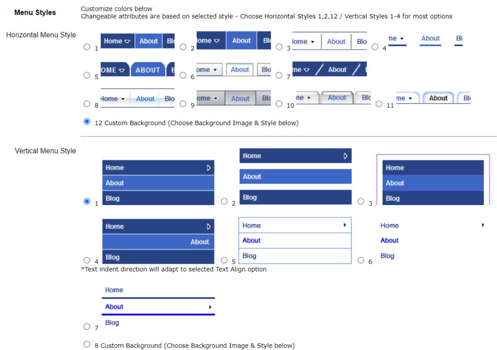
If you are thinking about this question for your website, you either have a very customizable website builder or building your website from scratch! You do have the option to choose which type of menu you want with UltimateWB website builder, with lots of styling options on the built-in Styles Manager that don’t require any coding. So is the horizontal or vertical menu best for your website?
The choice between a top horizontal navigation menu or a side vertical menu ultimately depends on the design and goals of the website. Here are some factors to consider:
Space
Horizontal menus take up less vertical space and can be a good choice for websites with limited space. Vertical menus take up more vertical space but can be a good choice for websites with more space.
Usability
Horizontal menus are often more intuitive and easier to use, as users are used to finding navigation options at the top of the page. Vertical menus can be harder to navigate and may be more suited to websites with a smaller number of navigation options.
Screen Size
Vertical menus may be more suited to smaller screen sizes as they can be scrolled through easily. But in the case of a smartphone screen size, for example, you will need the menu to be a button that opens up the menu for viewing, so that it is user friendly. Otherwise, the user would possibly be scrolling and scrolling menu items on each page before getting to your webpage content. Horizontal menus can take up too much space on smaller screens and may not be as user-friendly. But when you consider that your website should be responsive – i.e. reformat based on a user’s device size – this is essentially not a factor in deciding to go with a vertical menu for your desktop/laptop/tablet.
How to create your own responsive website without any coding!
Design
Horizontal menus can be a good choice for websites with a minimalist design, as they take up less space and can be styled to match the overall look and feel of the website. Vertical menus can be a good choice for websites with a more complex design, as they can provide more space to display navigation options and other content.
In Conclusion
Ultimately, both top horizontal and side vertical menus have their advantages and disadvantages, and the choice between them depends on the specific goals and requirements of the website. Either way, the menu on a smartphone or similar device size should be a menu button that opens up the menu, for the best user experience.
Creating Multi-Level Drop Down Menus
How to switch your website into a one-page website


