


The layout of a web page is one of the most important factors in determining its success. A well-designed layout can make a website easy to use and navigate, while a poorly designed layout can make it difficult for users to find the information they are looking for.
There are many different web page layouts to choose from, each with its own strengths and weaknesses. In this article, we will discuss 10 of the most popular web page layouts. We will also provide illustrations of each layout so that you can see how they work in practice.
By the end of this article, you will have a good understanding of the different web page layouts available and you will be able to choose the best layouts for your website.
1) Z-pattern layout
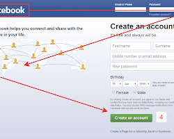
This layout is a popular choice for websites with a clear call to action, such as ecommerce websites. The user’s eye is drawn to the top of the page, where the most important information is located.
- Pros: The Z-pattern layout is very effective at drawing the user’s eye to the most important information on the page. This makes it a good choice for websites with a clear call to action.
- Cons: The Z-pattern layout can be a bit too predictable, and it may not be the best choice for websites that want to stand out from the crowd.
2) F-pattern layout
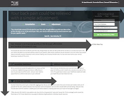
This layout is similar to the Z-pattern layout, but the user’s eye is drawn to the left side of the page, where the most important information is located.
- Pros: The F-pattern layout is similar to the Z-pattern layout, but it is more flexible and can be used for a wider variety of websites.
- Cons: The F-pattern layout can be a bit more difficult to design than the Z-pattern layout, and it may not be the best choice for websites with a lot of content.
3) Fullscreen image layout
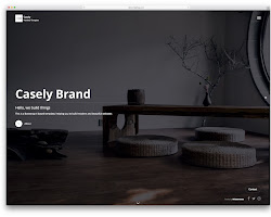
This layout is a great way to showcase a product or service. The entire page is filled with an image, and the user can scroll down to learn more.
- Pros: The fullscreen image layout is a great way to showcase a product or service. It can also be used to create a more immersive and engaging user experience, and create a sense of urgency
- Cons: The fullscreen image layout can be a bit too overwhelming for some users, and it may not be the best choice for websites with a lot of text.
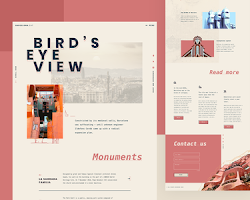
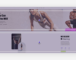
4) Split screen layout
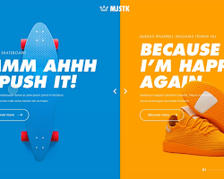
This layout is a good way to present two pieces of information side-by-side. It is often used for comparison websites and product pages.
- Pros: The split screen layout effectively presents two pieces of information side-by-side. This can be helpful for comparison websites and product pages. And be visually appealing.
- Cons: The split screen layout can be a bit too busy for some users, and it may not be the best choice for websites with a lot of content.
5) Asymmetrical layout
This layout is a bit more unconventional, but it can be very effective. The asymmetrical layout breaks the mold and can be used to create a unique and memorable website.
- Pros: The asymmetrical layout can be very effective, and be used to create a unique and memorable website.
- Cons: The asymmetrical layout can be a bit difficult to design, and it may not be the best choice for all websites.
6) Single column layout
This layout is a good choice for websites with a lot of text. The text is easy to read and the user can easily scan the page.
- Pros: The single column layout is a visually appealing and user-friendly option for websites with a lot of text. The text is easy to read and scan, making it a good choice for websites that need to communicate a lot of information in a clear and concise way.
- Cons: The single column layout can be a bit too boring for some users, and it may not be the best choice for websites with a lot of images.
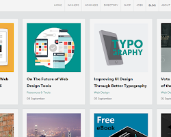
7) Box-based layout
This layout is a good choice for websites with a lot of content. The content is organized into boxes, which makes it easy to find what you are looking for.
- Pros: The box-based layout is a great way to organize a lot of content on a website. The content is divided into boxes, which makes it easy to scan and find what you are looking for.
- Cons: The box-based layout can be a bit too rigid for some users, and it may not be the best choice for websites with a lot of images.
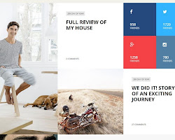
8) Cards layout
This layout is a good choice for websites with a lot of images. The images are displayed in cards, which makes them easy to scan and interact with.
- Pros: The cards layout is a great way to display images on a website. The images are organized into cards, which makes them easy to scan and interact with. This layout is a good choice for websites with a lot of images, as it allows users to quickly browse through the images and find the ones they are interested in.
- Cons: The cards layout can be a bit too cluttered for some users, and it may not be the best choice for websites with a lot of text.
9) Magazine layout
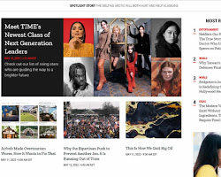
This layout is a good choice for websites with a lot of articles. The articles are displayed in a magazine-like format, which makes them easy to read and navigate.
- Pros: The magazine layout makes websites with a lot of articles easy to read and navigate, with articles typically organized in a grid-like format. It can be visually appealing, using a variety of fonts, images, and colors to create an engaging and stimulating experience for users.
- Cons: The magazine layout can be a bit too busy for some users, and it may not be the best choice for websites with a lot of images.
10) Horizontal strips layout
This layout is a good choice for websites with a lot of information. The information is displayed in horizontal strips, which makes it easy to scan and find what you are looking for.
- Pros: The horizontal strips can be used to create a sense of movement or flow on a page, highlight important information or call attention to specific areas of a page, and create a more visually appealing layout. The layout is easy to scan and find the information you are looking for.
- Cons: The horizontal strips layout can be a bit too overwhelming for some users, and it may not be the best choice for websites with a lot of text.
Happy designing!