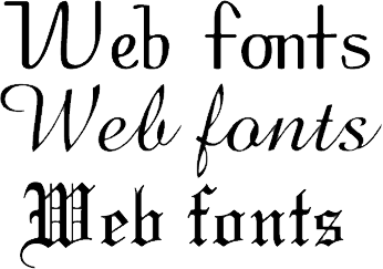
Here are some tips on how to choose web fonts that are both readable and beautiful:
Consider your brand.
What kind of image do you want to project with your website? Do you want to be seen as modern and stylish, or more traditional and conservative? Your font choices can help you communicate your brand identity.
Think about the purpose of your website.
Are you trying to sell products? Provide information? Entertain? The type of content on your website will affect the type of font you choose. For example, if you’re selling products, you might want to use a sans serif font that is easy to read and scan. If you’re providing information, you might want to use a serif font that is more formal and authoritative.
Consider the audience for your website.
Who are you trying to reach? What are their age, interests, and level of education? Make sure you choose fonts that are appropriate for your audience. For example, if you’re targeting young adults, you might want to use a more playful font. If you’re targeting professionals, you might want to use a more conservative font.
Test your fonts on different devices and browsers.
Make sure your fonts look good on all devices and browsers. Some fonts may not render well on certain devices or browsers, so it’s important to test them before you launch your website.
Optimize your fonts for performance.
Large font files can slow down your website, so it’s important to optimize your fonts for performance. You can do this by using a font service like Google Fonts or Adobe Fonts, which offer web-optimized fonts.
Make sure your fonts are accessible.
People with visual impairments or dyslexia may have difficulty reading certain fonts. Make sure your fonts are accessible by using a font that has a high contrast ratio and is easy to read.
Here are some popular web fonts that are both readable and beautiful:
- Sans serif fonts: Arial, Helvetica, and Roboto are all popular sans serif fonts that are easy to read on screen.
- Serif fonts: Times New Roman, Georgia, and Baskerville are all popular serif fonts that add a touch of elegance to a website.
- Display fonts: Display fonts are more decorative fonts that are often used for headlines or titles. Some popular display fonts include Bebas Neue, Montserrat, and Open Sans.
In Summary…
Ultimately, the best way to choose web fonts is to experiment and see what works best for your website. There is no one-size-fits-all answer, as the best fonts will vary depending on your brand, audience, and purpose.
Got a techy/website question? Whether it’s about UltimateWB or another website builder, web hosting, or other aspects of websites, just send in your question in the “Ask David!” form. We will email you when the answer is posted on the UltimateWB “Ask David!” section.


