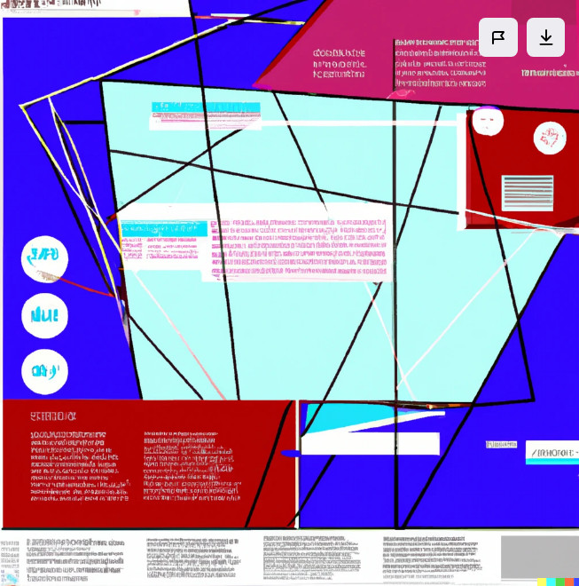
Ever felt the monotony of sleek, polished websites just wasn’t cutting it? Enter neubrutalism – the digital rebel here to shake things up. Let’s unravel the mystery of neubrutalism in web design and explore how it flips the script.
Imagine taking the rawness of Brutalist architecture (think exposed concrete and bold geometric shapes) and injecting it into the web. Add a dash of Y2K nostalgia (think glitchy visuals and funky typography) and a sprinkle of modern minimalism, and you’ve got the essence of neubrutalism.
Key Features of Neubrutalism:
1. Embracing Imperfection:
Neubrutalism laughs in the face of perfection. Forget flawless layouts; it’s all about celebrating the raw, unfiltered charm. Think bold colors, unconventional fonts, and layouts that don’t follow the rules.
2. Less Fluff, More Stuff:
Simplicity is the name of the game. Neubrutalist websites strip away unnecessary embellishments, delivering a straightforward user experience. It’s not about fancy graphics but about the content that speaks volumes.
3. Edgy Visuals:
Say goodbye to picture-perfect stock photos. Neubrutalism loves its visuals unpolished and edgy. High-contrast images, unconventional choices – it’s the rebellion against the curated and predictable.
How to Infuse Neubrutalism Into Your Website:
a. Embrace Asymmetry:
Forget about centering everything. Embrace the beauty of asymmetry – let elements flow in an unorchestrated dance that defies the norms.
b. Play with Typography:
Experiment with fonts that break the mold. Go big, go bold – neubrutalism celebrates typography that demands attention.
c. Bold Color Choices & High Contrast:
Ditch the safe palette. Neubrutalism thrives on bold, unexpected color choices that make your website pop and demand attention.
Is Neubrutalism Popular?
It’s still too early to declare neubrutalism a mainstream movement. However, it’s definitely generating buzz and attracting interest from designers and brands seeking to stand out from the crowd.
Why is Neubrutalism Gaining Popularity?
Several factors contribute to neubrutalism’s rise:
- A Reaction to Design Fatigue: People are tired of the same old, cookie-cutter website designs. Neubrutalism offers something different, daring, and memorable.
- Emphasis on Functionality: It prioritizes usability and clarity over pure aesthetics, ensuring a user-friendly experience.
- A DIY Spirit: Many Neubrutalist designs are created by independent designers, breaking free from corporate design trends.
Examples of Neubrutalism in Action:

Figma: The design platform’s website is a prime example, with its bold branding, grid-based layout, and unconventional use of whitespace.

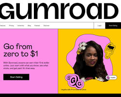
Gumroad: The e-commerce platform embraces neubrutalism with its raw aesthetic, high-contrast colors, and quirky illustrations.

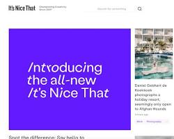
It’s Nice That: This online platform for showcasing creative work utilizes a grid-based layout with large, high-resolution images alongside clean typography, echoing some Brutalist ideals.
Challenges and Considerations on Neubrutalism:
While neubrutalism’s unconventional approach is refreshing, it comes with challenges:
- Accessibility: Low contrast and unconventional layouts can make it difficult for some users to navigate.
- Branding fit: Not all brands can pull off the raw, edgy aesthetic.
- Widespread adoption: It might take time for neubrutalism to gain mainstream acceptance.
The Future of Neubrutalism:
Whether neubrutalism becomes a dominant force or remains a niche trend is yet to be seen. However, its ability to spark conversation and challenge design norms is undeniable. It’s a movement worth watching, as it might just push the boundaries of what we expect from web design in the future.
So, while “popular” might be a strong word right now, neubrutalism is definitely one to keep an eye on. Its bold aesthetic and unconventional approach offer a refreshing alternative to the usual web design suspects, and its potential to evolve and adapt is exciting.
Is Neubrutalism Right for You?
Neubrutalism isn’t for the faint-hearted. If you’re tired of blending in and want to make a bold statement, it might be time to let your rebellious side shine. Experiment, break the rules, and infuse a dose of Neubrutalism into your digital presence.
In a world where conformity reigns, Neubrutalism is the rebel yell reminding us that perfection is overrated. Embrace the imperfections, break free from the ordinary, and let your website scream – “I am neubrutalist, hear me roar!”
Ready to unleash the rebel within? Dive into neubrutalism and watch your website transform into a digital maverick!
Are you ready to design & build your own website? Learn more about UltimateWB! We also offer web design packages if you would like your website designed and built for you.
Got a techy/website question? Whether it’s about UltimateWB or another website builder, web hosting, or other aspects of websites, just send in your question in the “Ask David!” form. We will email you when the answer is posted on the UltimateWB “Ask David!” section.


