How to create your own responsive website without any coding!
Whether you are just starting to create your website or already have built your website with Ultimate Web Builder, you can switch to Responsive Web Design (RWD) with one click of a button. Just turn the Responsive App ON. We already have preset it with suggested window values for the reformatting. You can customize it the way you want. No coding required! The software does all of the “CSS media queries” for you.
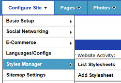
1) Go to Styles Admin Panel. Configure Site > Styles Manager to go to your default Stylesheet, or choose your Stylesheet from the Styles Manger > List Stylesheets page.

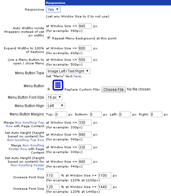
2) Scroll down to the Responsive App section, or just click on the "Responsive" link at the top here to jump there.

3) Responsive App section:
You can turn the Responsive Web Design App On/Off at the top here, by selecting Responsive Yes/No, repectively.

Then, you can choose various window sizes for each webpage reformatting change.
- Choose window width to automatically change set widths to auto widths, expand section widths to 100%, and turn the menu bar/column into a menu button
- Choose at which window width the top/footer non-scrolling rows, if applicable, merge with the rest of the page (i.e. scroll)
- Automatically Increase page font size at certain window widths - you set the window size/font size percentage increase
We have provided configuration suggestions for each setting, and you can tweak it how you want!
Like all the other UltimateWB apps, customization and flexibility is key; you can even customize your website menu button that appears instead of the menu bar/column, for smaller window sizes based on your setting.
The best part of this is that you have one website – one website to update and maintain – which can be viewed different on desktops/latops, tablets, and smartphones. A different format for a different device and window width, same content and design/branding.
Configure Website (1)
SEO Tool & Tips (1)
Stylize Website (1)
Responsive App (2)
Content Management (9)
Photos App (5)
Mosaic Grid App (1)
Password Protect, Members Restrict Acess (1)
Members & Social Networking App (17)
Social Login & Meta Tags (5)
Comments & Ratings App (5)
Page/Upload Likes & Unlikes App (1)
Page/Upload Shares App (1)
Timeline App (1)
Mailing List App (5)
Contact Form App (1)
E-Commerce App (10)
HTML Ad(d)s App (1)
Ad(d)s App (1)
Docs App (1)
Feeds App (1)
Backup Database Tool (1)
Custom Coding (1)
Sitemap Generator Tool (1)
RSS Feed Generator Tool (2)
Custom Internet Browser Favicon (1)
Admins & Moderators Management (1)
Multi-Language Website, Multiple Configurations (3)
Articles App (1)
Forms & Surveys Builder (1)
Polls App (1)
Calendar Events App (2)
Credits App (1)
Rewards App (1)
Listings Directory App (5)
Classifieds App (1)
Message Boards (Forum) App (1)
Scrapbooks App (1)
Photo Uploads App (2)
Video Uploads App (1)
Audio Uploads App (1)
File Uploads App (1)
Site Maintenance Redirect App (1)
Web Hosting Control Panel (11)


 Report a concern
 Add Comment