How to make content sections with custom formatting also RESPONSIVE
You choose a Page Format, but say you want to further format the Content section with tables or divs or paragraphs, i.e. columns, of set width. When the window size gets to a certain width, you are going to want these formatted sections to dynamically expand to 100% width, i.e. to be responsive. You can do this from the Content Editor Box itself, no coding required!
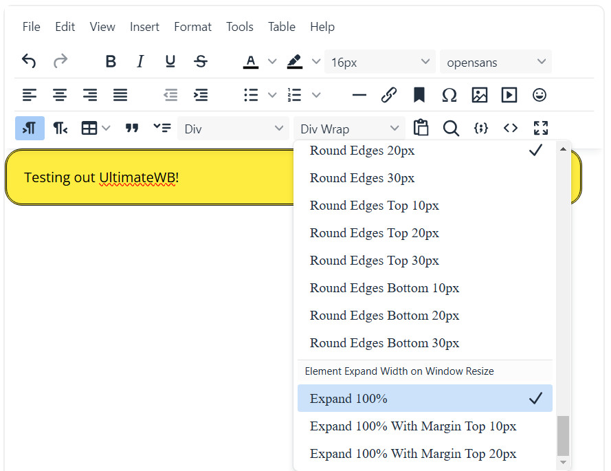
1) Click on or highlight the content section in the Content Editor Box, and apply the "Expand 100%" Style to it:

It is under the Styles menu, and just scroll down to it, to highlight. When it's selected, there will be a checkmark next to it, next time you open this menu and are on this content section that you applied this styling to.
You can also choose the styling "Expand 100% With Margin Top 10px" or "Expand 100% With Margin Top 20px", to add a top margin (spacing) of 10px or 20px respectively.
If you are not using tables or divs or setting widths to paragraphs to further format your content, and are just using the chosen Page Format, then the resizing of side columns, photo sections and text sections are done automatically already, based on your settings on the Styles Manager > Responsive App.
Configure Website (1)
SEO Tool & Tips (1)
Stylize Website (1)
Responsive App (2)
Content Management (9)
Photos App (5)
Mosaic Grid App (1)
Password Protect, Members Restrict Acess (1)
Members & Social Networking App (17)
Social Login & Meta Tags (5)
Comments & Ratings App (5)
Page/Upload Likes & Unlikes App (1)
Page/Upload Shares App (1)
Timeline App (1)
Mailing List App (5)
Contact Form App (1)
E-Commerce App (10)
HTML Ad(d)s App (1)
Ad(d)s App (1)
Docs App (1)
Feeds App (1)
Backup Database Tool (1)
Custom Coding (1)
Sitemap Generator Tool (1)
RSS Feed Generator Tool (2)
Custom Internet Browser Favicon (1)
Admins & Moderators Management (1)
Multi-Language Website, Multiple Configurations (3)
Articles App (1)
Forms & Surveys Builder (1)
Polls App (1)
Calendar Events App (2)
Credits App (1)
Rewards App (1)
Listings Directory App (5)
Classifieds App (1)
Message Boards (Forum) App (1)
Scrapbooks App (1)
Photo Uploads App (2)
Video Uploads App (1)
Audio Uploads App (1)
File Uploads App (1)
Site Maintenance Redirect App (1)
Web Hosting Control Panel (11)


 Report a concern
 Add Comment